Cool again....Bottega Veneta

I'm kinda in love with Bottega Venetta again. Remember is was cool, then lame and now its cool again.
Look at this new travel bag....
Its called Empire Lagoon Nero Vintage Calf Flag tote. The colors are cool and I am happy there are not a bunch of logos all over it.
I think this bag will be great on the nonexistent European jaunt I will take this summer.
Oh, its $2850.
www.bottegavenetta.com

Lovely Lovely Lovely Ines de la Fressange

These are the words going through my head as I left the book signing at Saks for Ines de la Fressange's new book titled Parisian Chic by F.  She could not have been lovlier.  If you do not know who she is ( you should by the way) google her.


The book is a style guide. It should have been titled: How to be Lovely. She gives her tips on fashion, beauty, shopping, entertaining and my favorite part... her faux pas.  Her overall advise is to keep it simple. Good advise. I always think that if you dress or entertain in an over the top "look at me" way, you've got it all wrong. Being subtle is far more elegant.

All of the portraits in her book are of her teenage daughter, Nine.  Ines could have put in pictures of herself but she didn't.... because she's cool.

 
 My favorite section is her fashion faux pas. Here is a sample of her fashion no no's:
1. Bras with transparent straps. A stylish, visible bra is far sexier.
2. Never wear a necklace and earrings at the same time-too much.
3. Body piercing- "No future" is the wrong kind of fashion statement.
4. Leopard- skin dresses with plunging necklines. Too sexy is not sexy.
5. Plastic flip-flops. Guaranteed to to shatter the chic-est of looks. ( Mom, pay attention.)

I think the book should be a required reading textbook in schools.
You can purchase the book at Amazon.com or if you are in NYC tonight Madame Ines de la Fressange is signing copies at the Roger Vivier shop on Madison Ave. You can rsvp to  rsvp@rogervivier.com  6:30-8:30.

A bientôt!

1stdibs Pick of the Week

Clearly, I am in my noir period.
                                                                           George Jouve Lamp
                                                                           French 1950-1960
                                                                           Antiques MC


                                                                                      Swivel Chairs
                                                                                             1971
                                                                                      1stdibs Paris


                                                                               Glass Orb Table Lamp
                                                                                            1970
                                                                          Palm Beach Antique and Design Center


                                                                      Directoire Gueridion Side Tables
                                                                                              1940
                                                                                       Pat Monroe

                                    
                                                                                 Ebonized Mirror
                                                                                          19th c.
                                                                               Linda Horsley Antiques

                                                                   Jules Leleu Armchairs
                                                                                1950
                                                                          1stdibs Paris


                                                                French Candlesticks Chandelier
                                                                                     1960
                                                                            Atomic Antiques


                                                                  Mauro Bonacina
                                                                  1977 Italian
                                                                  Charles Bank Gallery

                                                                English Leaded Glass Lanterns
                                                                               1920
                                                                       Carlos de la Puente

                                                                                   Sheep
                                                                                    1970
                                                                         Little Paris Antiques

I have a new boyfriend. His name is The Bowery Hotel.


The Bowery Hotel in New York

I am in love. I just met The Bowery Hotel.  It's like dating the twin brother of my other boyfriend, Hotel Costes in Paris. Mr Bowery is everything I am looking for: moody, dark, mature and chic but not uptight. Go to their website to see more images:  www.theboweryhotel.com  go now.

My Platinum Years

I realize that this is suppossed to be a Marcel Breuer tandem type bike but I have envisioned a different use for it. I am imagining that this is my future mode of transportation when I am old.

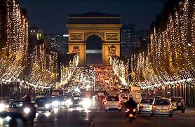
I will enlist my cousin, Julie, as the lead driver and I, the passenger. She will ride me along the Champs Elysées in Paris to my hearts content beeping the little horn for me. If you have the same idea you can purchase this at www.knoll-int.com

D'Espresso Coffee in New York

There is nothing wrong with this coffee shop.
 Nothing.
It's perfect.
Look at it.
 First of all its got the "cool concept" down.
It looks like a tilted library.
Then it gets better...
The books are a sepia toned replica of library books on, not wallpaper, but TILE!
 Then the herringbone floors on the walls!
I like how the small space looks like it goes on and on. The counter helps this with its length.
 Then the long continuous bench, perfect round tables that mirror the lights, then the perfect ghost chairs that disappear and not make it look like too much furniture is crammed in the space.
 The design was done by Nemaworkshop in New York.
They do a bunch of cool stuff. Check out their website if you want.

Remember though, as my mom says, behind every great designer is the owner okay'ing it. So, congrats to the owners for okay'ing this. I heard they want to open many more of these coffee shops. This is okay in my mind IF they vary each one a bit AND don't charge more than a dollar for coffee. No one needs coffee that is over a dollar.
                                                             They have two locations so far.
                                                             Lower East Side and Midtown.
                                                                           Goggle it.
                                                                http://www.despresso.com/

Bad use of a perfectly good zebra rug

I love a zebra rug. I do. I know I shouldn't but I do. I fell in love with zebra rugs the first day I saw one on the top floor in the home collection of Ralph Lauren. But, here's what I don't love. I do not love it when people put their zebra rug at the wrong angle. Its very important not to do this. Its easy NOT to do this. Look:

This is the perfect example of how to use a zebra rug. The most important step in using a zebra rug is the angle. The wrong angle use can make it look like you are walking directly into the zebra's bum. Not good. 


Now look at this one:
See? This is wrong. It looks like you are walking right IN it. Additionally, this rug is too big. Small doses are key. I love this bathroom but if they had just angled it better and found a bit smaller rug it would be perfect.


And for god's sake, if you are going to commit to getting a zebra rug, get a REAL one. Its not like you are being a better person by getting a cowhide zebra rug. FYI, cows are animals too.


Here are some examples of improper embarrasing uses of zebra rugs.
 Bad angle but great blue chairs. This is a nice room but if they had just bought a real rug and angled it better it would have been great. Oh, and gotten rid of that Tuesday Morning cachepot on that beautiful guerdion table. 
This is a great room but if they had just turned that beast around at a slight angle and bought a real zebra it would be perfect. Who wants to walk into a room and walk into a zebra's privates?
I love this room but I think the rug should be turned a bit, no? And real. It's like, "I'm a cow dressed a zebra, Surprise!"  Love the room though.

This almost works but if they had just angled it under the bed a pit it would be perfect. I also like the layering of a sisal and then a zebra. Gives it some depth.


Yikes. Looks like the zebra went, "Splat!" On a side note, there are too many little pieces here. A small sofa would have been better and then the table. I love the table. At least they used a real zebra.


Okay, now for some good examples of zebra rugs:
This is perfect.

Perfect

So, to sum up MY thoughts on zebra rugs:
1. Angle it
                                                                          2. Use a real one
                                                                          3. Only use one zebra per house.
                                                                          4. Use appropriate size


I'm baaaaaaaaack!

Its been a while since I've have posted anything party due to the fact that I had not been inspired by anything....until this.

Jennifer Rubell has combined her B.A. in Fine Arts from Harvard and her education at the Culinary Institute of America into a career that is so astonishingly clever that it made me want to blog again.

Her website states, "Jennifer Rubell creates participatory artwork that is a hybrid of performance art, installation, and happenings. The pieces are often staggering in scale and sensually arresting, frequently employing food and drink as media: one ton of ribs with honey dripping on them from the ceiling; 2,000 hard-boiled eggs with a pile of latex gloves nearby to pick them up; 1,521 doughnuts hanging on a free-standing wall; a room-sized cell padded with 1,800 cones of pink cotton candy.
Viewers are encouraged to partake in the work, violating the traditional boundaries of art institutions and engaging senses usually forbidden in or absent from museum and gallery contexts. Rubell’s work explores the intersection of the monumental and the ephemeral, and serves as a counterpoint to the virtual nature of much of contemporary life."

My favorite exhibit/party is called Icons.  Rubell has cast her head in Fontina cheese and suspended it above a table of crackers. Hairdryers work their magic and gently drip the cheese down as guests catch it with their crackers. How could anyone not love that?


In this exhibit also are taps straight out of the wall with little placards stating what it is like Dirty Martini or Gin and Tonic.  I wish I had this at home.


Then, to top that, there is a mound of potato chips and paint tube of dips.

There are so many clever ideas that Jennifer has designed that it makes the rest of us losers (who think chicken satay on a bamboo stick is genius) look like novices and we should never have a party again because it will all pale compared to this.


Go to her website to see more and to read about the thought process behind each exhibit.  
http://www.jenniferrubell.com